
There is no shortage of beautiful hotel websites. The hospitality industry is full of properties with compelling photography, elegant typography, and sophisticated design. But beauty is not conversion. A website can look exceptional and still fail its primary function: turning a visitor into a direct booking.
The best boutique hotel websites share a set of structural and strategic qualities that go beyond aesthetics. They are built around how guests actually behave. They earn trust progressively. They make the booking action feel effortless and inevitable. And they treat every design decision — from the hero image to the CTA button — as a revenue decision.
Below, we break down ten approaches to boutique hotel website design — drawn from patterns seen across the best-performing independent properties — and identify precisely what makes each one work. These are not just design observations. They are conversion lessons that any boutique hotel can apply.
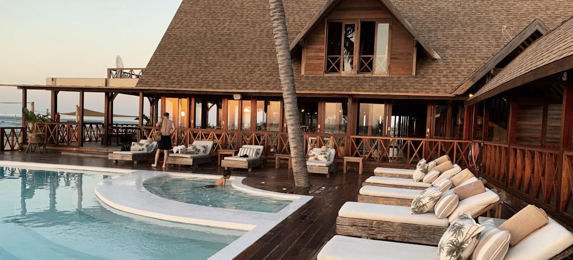
What it looks like: The homepage opens with a full-screen, slow-panning video or high-resolution image that captures the feeling of the property — candlelight in a stone-walled dining room, mist over a mountain terrace at sunrise, a sun-drenched courtyard in golden hour. No text overlay. No navigation clutter. Just atmosphere, held for three to four seconds before the rest of the page loads.
Why it works: Boutique hotel guests are not booking rooms — they are booking experiences. The first three seconds of a homepage visit form an impression that is extraordinarily difficult to reverse. An atmosphere-first homepage answers the most important question a guest has before they consciously ask it: how will it feel to be here? Properties that nail this create emotional commitment before a guest has read a single word of copy.
What to take from it: Invest in hero imagery or video that captures atmosphere, not architecture. Still photography of an empty lobby does not create desire. A low-lit evening scene with guests visible in soft focus does.
The cross-channel implication: The same atmosphere-first visual should lead your paid media creative and your email campaigns. When a guest who clicked an Instagram ad and then receives a pre-arrival email, both should feel like the same world — the same light, the same tone, the same emotional register.
What it looks like: An About page that reads like a personal letter from the owner — the history of the building, the decision to open a hotel, the people who make it run, the philosophy behind the food, the reason the property is in this particular neighbourhood. Photographs of the founders and team. A map showing the location in context. No corporate language anywhere.
Why it works: Independent hotel guests are choosing not to stay at a chain. They want the opposite of anonymous. An About page that reveals the human story behind the property gives guests exactly what they are looking for — and does something OTAs categorically cannot: it makes the property feel real and personal before the guest has arrived.
What to take from it: Your About page is not a biography. It is a conversion asset. The goal is for a guest to finish reading it feeling like they know the people running the property and want to meet them. That feeling translates directly into booking confidence.
The SEO implication: Unique, well-written About pages with proper keyword structure rank well for branded and local searches. “Boutique hotel owned by [name] in [city]” — the kind of search a guest makes after discovering a property on an OTA — should surface your website’s About page prominently.
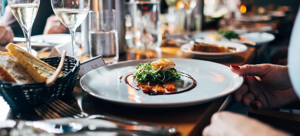
What it looks like: Each room has its own named page — not “Superior Room” but “The Garden Suite” or “The Attic Room”. The page opens with multiple photographs from different angles and times of day. The description reads like a short story: what the room feels like in the morning, what you can hear from the window, what makes this specific room worth requesting. Practical details (size, bed configuration, amenities) follow the atmospheric copy, not lead it.
Why it works: Guests booking a boutique hotel want to know what it will feel like to sleep in that room, not just how many square metres it covers. Room pages that sell the stay — the experience of being in the space — create the specific anticipation that drives booking decisions. Pages that list amenities in bullet form create comparison shopping.
What to take from it: Name your rooms. Write descriptions that read in the present tense and place the guest in the space. Save the amenity list for the end. Ensure every room has dedicated photography covering multiple scenarios — daytime, evening, bathroom, view.
The paid media implication: Room-specific pages make excellent landing pages for targeted campaigns. A Google Ad promoting “romantic rooms with garden views” should land on the specific room page with garden views — not the general rooms listing. The specificity of the match between ad and landing page directly determines conversion.
What it looks like: Rates are visible on the website without requiring a booking engine search. A simple table or rates section shows the range of nightly rates by room type, by season, with inclusions clearly stated. A best-rate guarantee is prominently featured — “book direct for the best available rate, always” — with a brief explanation of what that means.
Why it works: Pricing opacity is one of the most common trust failures on hotel websites. When a guest cannot see rates without entering the booking engine, they feel they are being drawn into a funnel before they have made a decision. Transparent pricing communicates confidence and respect for the guest’s time. It also removes the most common reason guests visit OTAs: to compare prices.
What to take from it: You do not need to publish live availability on your main website pages. But giving guests a rate range, clearly stated inclusions, and a direct booking incentive on the rooms page — before they enter the booking engine — reduces abandonment and builds trust.
The email implication: Email campaigns promoting seasonal rates should drive to pages that display those rates without friction. A guest who clicks a “from €150 per night” email and cannot find that rate on arrival is unlikely to persist.
What it looks like: A dedicated section of the website — not a blog post buried in the archives, but a persistent, well-structured section — covering the neighbourhood, the city, and the region. Recommended restaurants, with actual opinions from the hotel team. Walking itineraries. Seasonal events. Hidden spots that only locals know. Written in the voice of someone who lives there and loves it.
Why it works: Guests choose a destination before they choose a hotel. A local area guide that positions the hotel as a knowledgeable guide to the destination adds value that a purely transactional website cannot. It also generates significant SEO value — “best restaurants near [landmark]”, “things to do in [neighbourhood]”, “weekend itinerary [city]” are all searches made by guests in the consideration phase, and well-structured local content ranks for them.
What to take from it: The local area guide is one of the highest-ROI content investments a boutique hotel can make. It attracts organic traffic from guests who have not yet chosen a property, introduces them to your hotel, and provides internal linking opportunities back to room and booking pages.
The analytics implication: Track which local area guide pages are generating booking engine clicks in GA4. These pages — often the highest organic traffic pages on a boutique hotel website — are often the most underleveraged for conversion.
What it looks like: A dedicated offers page — prominently linked from the main navigation — displaying current seasonal packages and rate promotions. Each offer has its own section with a clear name, a compelling image, a concise description of what’s included, the rate, the booking dates, and a direct CTA to book that specific offer. No generic “contact us for more information”. A booking button, right there.
Why it works: Guests who visit an offers page have high purchase intent. They are looking for a reason to book. An offers page that makes the booking action immediate and friction-free converts this intent into reservations. An offers page that says “contact us for availability” loses it.
What to take from it: Your offers page is a direct booking tool, not a brochure. Treat it as such. Each offer should have its own URL — so it can be linked from email campaigns and paid ads directly — and a dedicated booking CTA that goes to the specific offer in your booking engine, not to the general availability search.
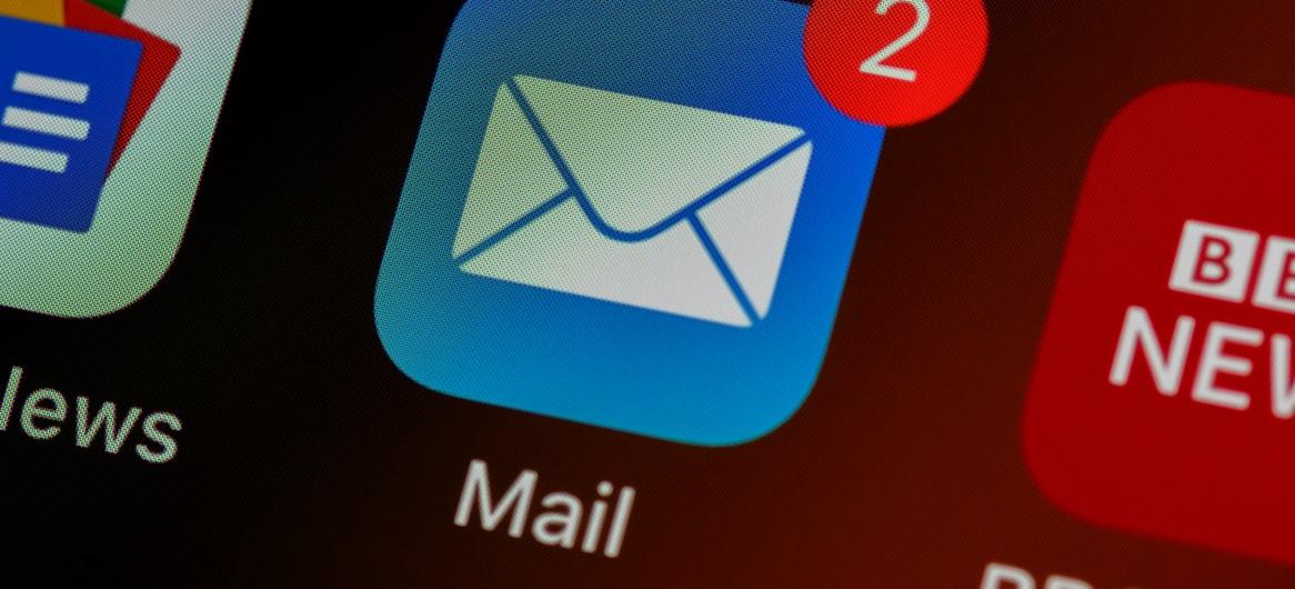
The email implication: Your email list is the primary audience for your offers page. Every email campaign promoting a seasonal package should link directly to that package’s page — with UTM parameters so GA4 can attribute bookings to the campaign. This is one of the most measurable channels in hotel digital marketing.
What it looks like: From the moment a guest clicks “Book Now” to the moment they receive their confirmation, every step reinforces trust. The booking engine visually matches the website. The hotel logo is visible throughout. SSL is active. Payment logos are displayed. The cancellation policy is stated in plain language before the payment step. A genuine review score — “9.2 on TripAdvisor, 4.8 on Google” — appears in the booking engine header. The confirmation email is warm, branded, and links to useful pre-arrival information.
Why it works: The booking flow is where trust is tested most acutely. A guest handing over payment details to an independent hotel they have never stayed at is extending a degree of trust they do not extend to OTAs. Every trust signal visible during that process reduces the psychological friction of completing the transaction.
What to take from it: Audit your entire booking flow as a guest would experience it — from the first click to the confirmation email. Identify every point where a trust signal is missing, every visual inconsistency, every moment where a guest might reasonably feel uncertain. Fix them in order of severity.
What it looks like: The rooms overview page displays each room type as a large, full-width photographic card — one striking image that captures the room’s character, the room name, a single line of descriptive copy, and a “View Room” button. No rate tables on this page. No amenity lists. Just photography and an invitation to explore further.
Why it works: The rooms page is typically the second or third page a guest visits. By this point, they are comparing options. A photography-led listing page does not compete on specifications — it creates differentiation visually, allowing each room’s distinct character to communicate before a guest reads a word of copy. Guests self-select to the rooms that appeal to them, arriving on the room detail page already predisposed to book that specific option.
What to take from it: Your rooms listing page should create desire, not deliver information. Information belongs on the room detail page. The listing exists to showcase the range of the property and draw guests into the specific rooms that match what they are looking for.
What it looks like: Everything that defines the desktop experience — the atmospheric photography, the distinctive typography, the clean navigation, the prominent booking CTA — translates cleanly to mobile. The navigation collapses to a simple hamburger menu with five items. The booking bar is persistent at the bottom of the screen. Images load quickly and display in formats optimised for portrait orientation. The booking engine is as easy to complete on a phone as on a laptop.
Why it works: Over 60% of hotel website traffic arrives on mobile. A site that delivers a compromised mobile experience — slower, harder to navigate, more friction in the booking flow — is delivering a compromised experience to the majority of its guests. Properties that invest in mobile experience parity typically see immediate conversion improvements in their mobile traffic segment.
What to take from it: Test your site on a real phone, not a browser’s responsive mode. Complete the full booking journey. Every point of friction is a booking you are not getting. Mobile parity with the desktop experience is not a design aspiration — it is a revenue requirement.
The paid media implication: Most paid social traffic — Meta, Instagram — arrives on mobile. If your mobile experience underperforms, your social advertising investment is being partially wasted. Speed and UX on mobile directly affects the return on every social campaign you run.
What it looks like: A blog that reads like expert hospitality advice rather than a promotional newsletter. Articles covering topics guests are actively searching for — how to choose the right hotel in the city, what to do during the shoulder season, where to eat within walking distance, how to plan a weekend for a specific occasion. Each article is well-structured with proper headings, optimised for a specific search term, and contains relevant internal links to room pages or the booking engine.
Why it works: Blog content that ranks for search terms guests use during the consideration phase — before they have chosen a property — introduces those guests to the hotel at the earliest stage of their decision. A guest who arrives via a blog post about “the best neighbourhood in [city] to stay in” and finds the hotel positioned as the authority on that neighbourhood is more likely to book than one who arrives cold via a generic search.
What to take from it: Blog content should be written with a specific search term in mind, structured with proper H1/H2 hierarchy, optimised for Core Web Vitals, and linked internally to conversion pages. Traffic without conversion pathways is wasted. Every blog post should have a logical next step — a related room page, a seasonal offer, a booking CTA — that moves the reader toward a reservation.
The analytics implication: Track which blog posts generate booking engine clicks in GA4. Use this data to identify the content types and topics that attract guests with booking intent — and produce more of them.
Across all ten of these approaches, the pattern is the same: the best boutique hotel websites are built around how guests actually behave and what they actually need to make a booking decision. They do not just present information — they guide, reassure, create desire, and remove friction at every step of the journey.
None of these approaches requires an unlimited budget. They require clarity about what a hotel website is for and the discipline to build it around that purpose.
At The Lobby, we design hotel websites for independent and boutique properties that are built around this framework — from brand identity through to booking engine optimisation and analytics setup.
See how we can improve your website →
The Lobby is a hospitality digital marketing agency working with independent hotels and restaurants across Europe. We combine SEO, paid media, and website strategy to grow direct revenue.
The Lobby designs high-performing websites for independent hotels — built around the guest journey and optimised for conversions.